Moody’s Copilot
A Gen AI Chat Experience
Moody’s Copilot is a project where I redesigned a Generative AI chat experience for Moody’s employees to increase overall adoption. The original interface was outdated, hard to use, and used only by power users, so the design team and I conducted a holistic evaluation of the site experience to understand where we could make improvements. After our evaluation, we recommended a recreation of the experience from the ground up.
Duration
May 2024-Feb 2025
Team
1 PM, 1 designer, 4 devs
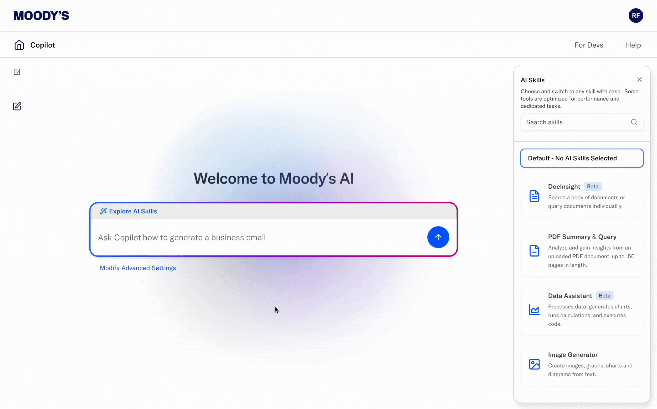
A snapshot of the final design shows chat history, advanced settings, and feedback mechanisms.
Why (re)design a Generative AI Chatbot?
Financial analysts within Moody’s often spend hours conducting research and finding sources to create risk reports. The first release of Moody’s Copilot saw a self-reported increase in productivity and efficiency by 20%, cutting costs for the business. However, the adoption rate across the company was still under 50%, meaning that the majority of the company was not using this tool. As a result, one of leadership’s OKRs became our team’s responsibility to see an increase in this metric. After conducting an audit and heuristic evaluation, the design team and I concluded that a redesign was necessary to overhaul the user experience and create a more modern and usable interface.

Within the Moody’s Copilot platform, we allow people to upload and manage files that the platform has processed.
What else can people do in the tool?
Other than chat with the bot, upload and summarize files, search the web, retrieve company information, and more, Moody’s Copilot allowed the user to share files that they’ve uploaded to other people in the system. This allowed people to use the “chat with your data” feature, where people selected a certain group of files to ask for information. For example, someone could upload a set of documents listing out Moody’s legal and compliance policies and ask the chatbot to analyze whether or not a new policy would abide by said policies. This feature was the second most used feature in the tool, so we rethought the process to share files by leveraging common permission sharing patterns seen in Google Drive, Dropbox, or Figma.
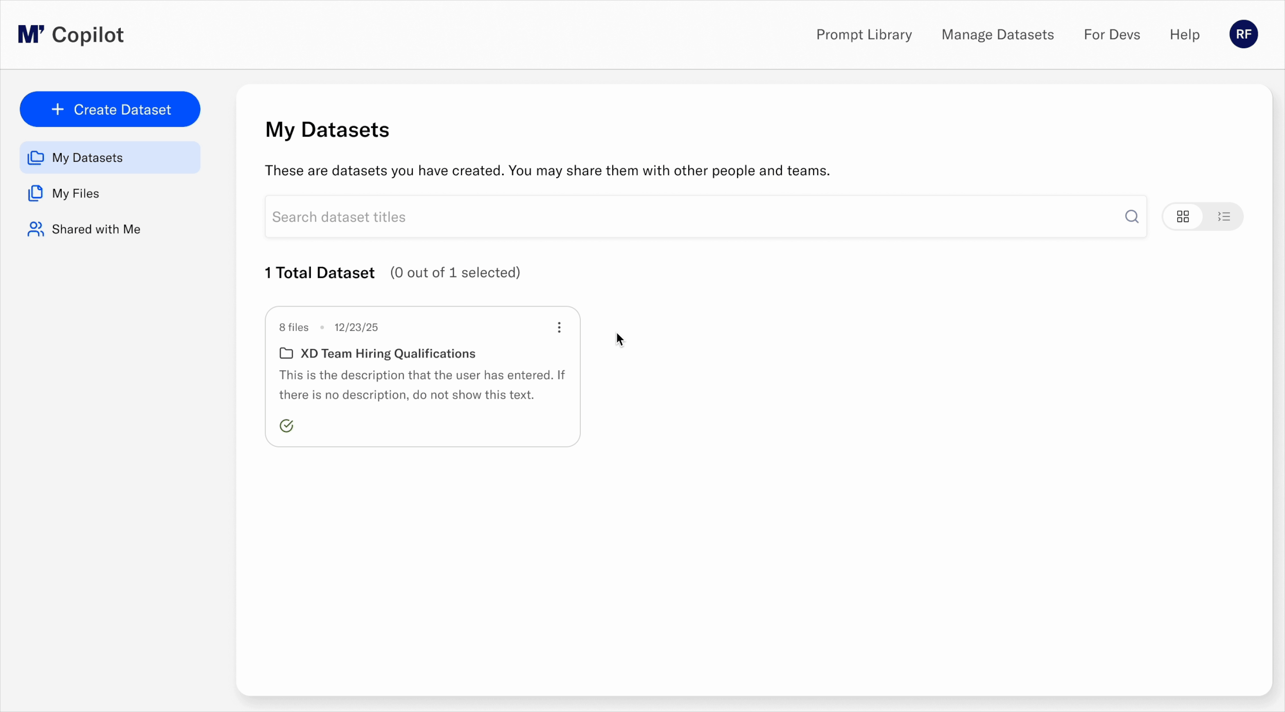
People can share datasets with an AD group or with individual users by email. Previously, the create and share workflow were combined in one long form. I separated the two workflows out to simplify the experience so that people could create their datasets first before choosing to share it with others.
How did I bring people onboard?
While the end result may seem simple and obvious (after all, there were already many established leaders in the Gen AI industry doing this already), this was a non-obvious solution to the product team at the time, and there was internal resistance to changing something that seemed to already work. To bring others onboard, I gathered a library of screenshots from the leading Gen AI companies (ChatGPT, Sana, Perplexity, Claude, Gemini, etc.) and shared the competitive analysis to evangelize the idea of a new interface that would be on par with what consumers already see and are used to. I also collaborated with a UX Researcher to test out early concept and designs and presented the report to internal stakeholders to receive leadership buy-in.
In the first concept I created, I modeled ChatGPT’s experience to ease the product team into a new design by leveraging familiar patterns.
Who did I collaborate with?
I created the ultimate design deliverables, but I collaborated early on with the Experience Design team, which included two other designers, a UX researcher, and 1 design leader. We critiqued early concepts like the one shown above and explored various ideas.
In the next concept I created, I designed a homepage to communicate the value of Moody’s Copilot to end users because a finding that came out of early research was that people were unsure of Copilot’s value to their personal day-to-day work. I would later remove this homepage as I discovered through additional testing that people really wanted to chat with the tool rather than scroll through a bunch of information.
How was the new design different?
To begin, the legacy design did not have a chat anywhere visible on the homepage. It was a collection of features that users had to read to understand, then click into to navigate to. This extra step was likely the main cause of the large numbers of drop-offs we were seeing. In addition, the visual design was outdated, which we wanted to update.
In the legacy design, there was no clear call to action on the homepage, leading to significant drop-offs in the experience.
How did I measure success?
To measure success, we planned on tracking unique users who logged into Copilot and were looking for that number to increase. We also planned to see any changes in number of people who use each particular skill to see if updating the design encouraged any new users to any particular skill. Finally, we planned on measuring the number of active users who have uploaded datasets. Currently, there were 2,000 active users who have uploaded a total of 6,000 datasets, but we expected this number to grow as we also updated the file management system.